February 13, 2017
What are color separations, or “seps?” To screen print images with more than one color, each color requires a separate screen.
If the image has gradations, shading or photorealistic elements, those parts of the color separation need to be converted to halftone dots that can be burned onto a screen
Following are details on types of separations common in the decorated apparel industry.
Spot Color: This is the bread and butter of the industry. Spot-color images generally have specific solid colors, but also can have small halftone dots for shading. Spot-color separations and prints generally are used for logos, school designs, clip art, hard-edged graphics, cartoons or other images that have a dark outline. These separations are done in vector-based graphic programs such as CorelDRAW and Adobe Illustrator.
Process Color: Process-color images are comprised of cyan, magenta, yellow and black (CMYK). All magazine photos and traditional offset/litho paper-printed items use only these four colors. If you used a magnifier when viewing the images, you would see small halftone dots that — when printed — make up most of the colors in a rainbow.
If separations aren’t done properly, the images will be muddy and colors can shift. Faces turn red, dark areas get darker, etc.
For these reasons, process-color printing is not for everyone. It generally requires better control, with properly tensioned, high-mesh-count screens, and the ability to hold fine halftone dots and print them in register with minimal dot gain (halftone dots get bigger when printed). The secret to successful process-color prints is proper separations and good printing.
Process-color separations generally are not done in vector-based programs like CorelDRAW or Illustrator. Instead, they are done in Adobe Photoshop.
Simulated-Process Color: This also is known as “fake”process color or “fake CMYK.” Simulated-process-color images have a photorealistic look, but are not printed with CMYK colors. They have the look and feel, but the separations are comprised of solid and halftone images of spot colors such as red, yellow, blue, gray, green, brown, black, etc. They often are called “tonal” or “channel” separations. Simulated-
process-color separations can be printed on light and dark shirts, and generally are created in Photoshop.
Index Color: This probably is the most confusing of the separation methods. For the other separation types, shading is done with different-sized halftone dots that have a definite pattern and angle. Index-color separations are done in Photoshop and use random square dots that are all the same size. These random dot patterns often are called diffusion dither or stochastic.
When To Use Each Method
CMYK-Process Color: This method is great for photorealistic images on white or light shirts. It requires good separations, and great screen making and printing technique. The best CMYK process prints have additional spot colors.
Simulated-Process Color: This is great for dark shirts that need a photorealistic image, but also will work on light shirts. It requires good separations, screen making and printing technique. It also can print smooth gradations and hold excellent detail. This is the most popular method used by award-winning printers. The resulting prints are bright because all-purpose inks are used.
Index Color: This method works on light and dark shirts, but typically requires more colors than simulated-process or process-color prints (especially on black shirts). It is easy to print using this method because all the dots are the same size and it involves printing square dots next to other square dots instead of printing halftone dots on top of other halftone dots. Separations are easy to do in Photoshop, screen making and printing can be forgiving, and the entire process is production friendly.
Vector Programs
The main vector programs are Illustrator and CorelDRAW. Both do similar things and are ideal for “hard-edge” graphics. The programs contain hundreds of fonts and are mainstays in the industry.
Typically in a vector program, you can arch or manipulate text, fill it with color, give it an outline, include the customer’s logo, use a piece of vector stock artwork (called clip art) and more.
However, it’s important not to work with CMYK color when assigning a color to an image. Both programs use CMYK color as the default. In CorelDRAW, this is called a palette and in Illustrator, it is called a swatch.
You want to use a “spot-color” palette/swatch often called a Pantone palette. That way, when you fill an image with red, you only have to print one film for that color. If you use the CMYK palette and fill an image with red, you will need two films: one for yellow and one for magenta (when printed, yellow and magenta make red). This is not preferred.
To create separations, simply create the image and ensure all the colors are from a spot-color palette. Just remember that the number of colors must not exceed the number of colors you can print.
Printing Color Separations
The problem with printing separations from any program is that somehow you need to convert gray areas to halftone dots. And for better screen making, you need a printer that prints dark images on clear film.
The industry standard now is to use inkjet printers for film positives, as they can print CMYK and other variations of it. They are not designed to print dense black or halftone dots.
You need industry-specific, third-party software called a raster image processor (RIP), which sells for about $500. You also can purchase an inexpensive inkjet printer that will print 13″ x 19″ film for about $300.
Simply print to the RIP from CorelDRAW or Illustrator. And you can set the halftone frequency (number of halftone dots per inch), dot shape (ellipse is a good choice) and halftone angle to minimize ugly moire patterns when you burn a screen. A good choice is 22.5-25 degrees.
Raster Programs
Photoshop is the world’s most popular raster/pixel program. If a customer supplies a JPG file, web graphic, low-resolution image, full-color picture or anything that is not vector, it can be incorporated into the image in a vector program. But it is difficult to separate this in a vector program (other than CMYK). That is where you need Photoshop because it creates “channel” separations.
When you walk into Wal-Mart and see a hot, vibrant, full-color image on a dark shirt, it may have been “built” in CorelDRAW or Photoshop, but I guarantee you it was color separated as simulated-process color in Photoshop.
Scott Fresener has been in the industry since 1970 and is the co-author of the book “How To Print T-shirts For Fun And Profit” along with dozens of video and DVD training programs. Scott is the director of T-Biz Network Intl. To comment on this article, email Scott at scott@tbiznetwork.com or visit T-BizNetwork.com.
March 20, 2024 | Production
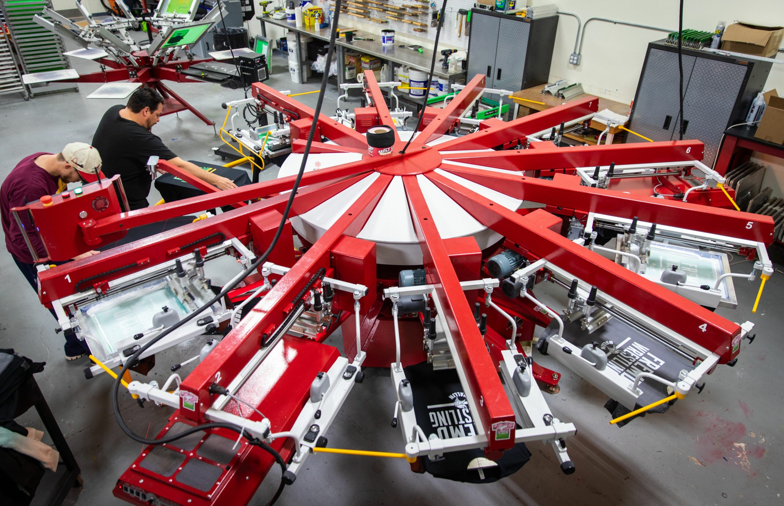
As with pretty much any business, one of the keys for apparel and T-shirt decorators running a successful custom screen-printing shop is having the right equipment, first and foremost, the right press, or presses.
FULL STORY
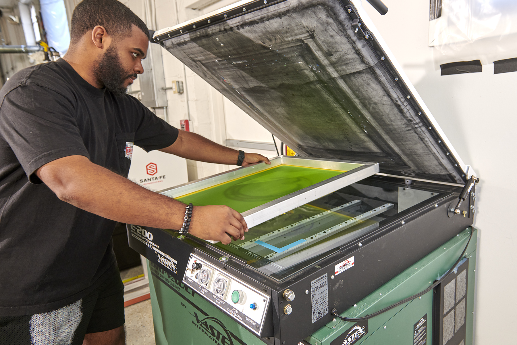
March 15, 2024 | Production
As is the case with flash units and dryers, screen exposure units, computer-to-screen-systems and washout booths are critical to successful screen printing of T-shirts and other apparel
FULL STORY
January 16, 2024 | Production
Go to any industry trade show or visit an actual custom apparel screen-printing shop, and your eyes will naturally be drawn to the press, or presses there. This is true whether the shop in question employs a single manual press or is running multiple autos.
FULL STORY