October 12, 2016
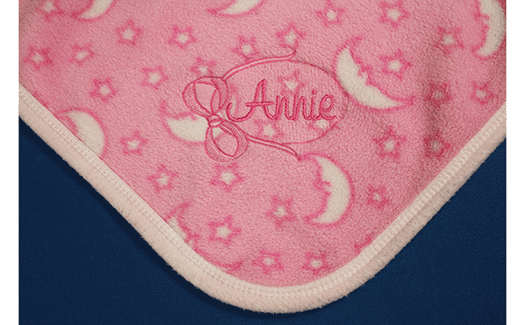
There’s nothing quite as personal as monograms. They evoke memories and nostalgic feelings with their charm and tactile qualities.
When creating a monogram, one guiding principle should be your mantra: It should last as long as the item to which it is applied. You can ensure your monograms will continue to look as beautiful as they did the day they were created by applying the following best practices when programming and digitizing them.
Underlay and Density
When creating standard lettering for a company name or other types of standard embroidery, it may be OK to stick with the default settings that control underlay stitching and density. However, monogram settings deserve special attention.
Underlay serves as the foundation for the top layer of stitching. The correct type of underlay for a monogram depends on the letter size and the material to which the monogram is being applied. Very small lettering (3⁄8 inches in height and smaller) should have a center line underlay to tack the stabilizer to the fabric and provide a light foundation.
Larger lettering may use zigzag, double zigzag or zigzag combined with edge-walk underlay. Figure 1 shows each type for reference. Zigzag underlay is suitable for most letter sizes that are applied to lightweight, medium-weight, stable or unstable materials that have no pile or deep texture. The default setting for the underlay stitches’ spacing usually is light, but adjustable.
Consider making the underlay’s stitch spacing (density) closer for a richer, lusher monogram. This is kinder to lightweight materials, a better alternative than increasing the top layer’s density.
Double-zigzag underlay provides two offset zigzag layers, making it a good choice for heavier fabrics with pile or deep texture, such as towels and bulky knits. This type of underlay better holds down loops of plush terry towels and the pile of fleece. In fact, it’s possible to eliminate the use of water-soluble topping on certain fleece materials when the pile is laid down with a double-zigzag stitch layer.
Zigzag or double-zigzag underlay also can be combined with edge-walk underlay to help provide a boundary for satin stitches, creating crisp edges for columns. This is helpful for clarity on textured fabrics like piqué knits. It helps the letter’s formation remain true to its original form throughout the life of the item.
Letter Size
Monogramming is simpler for lettering that is ½-inch to 2 inches in height because the character construction is fairly standard and the preferred stitch type — satin — is quite suitable and long-lasting. However, many popular monogram types don’t fall within this size range.
Small lettering sizes such as those used for men’s shirt monograms require special construction to stitch cleanly. Embroiderers reducing fonts intended for standard letter sizes to 1⁄4-3⁄8 inches find that the reduced lettering appears clumpy in some areas. It also often has small knots on the underside.
Figure 2 shows a comparison of a font created for a standard-sized letter and the same letter constructed for a small letter size. The construction for the smaller size has only a center run underlay and construction that avoids the overlaps seen in the standard font.
Another unique characteristic found in letters constructed especially for small sizes is that stitch-direction changes are minimal. Figure 3 shows a serif-style font letter created for standard and small sizes. Notice that the stitches in the serifs for the small letter size flow in the same direction as the main column. This avoids the clumps where direction change occurs.
When size 40 thread is used for lettering 3⁄8-inch and smaller, a density of five points will produce the best clarity. For size 60 thread, a density of four points is recommended for sharp, crisp lettering while maintaining the appropriate fabric coverage.
Large Lettering
With the surge in popularity of oversized monograms on everything from sweat shirts to shower curtains, it’s important to know your stitch-type options.
When letters get taller, the stitch width increases. When stitches are wider than about 7mm, the possibility of them snagging and unraveling increases. Some embroiderers leave the stitch type as satin while other change to a fill stitch, also called tatami.
The satin stitches may snag, and the fill stitches are flat and uniform in appearance, making neither a great choice.
Split or blended satin stitches are better alternatives because they maintain the fluid appearance of a standard satin stitch while using shorter stitch lengths. Here’s how it works: Some software programs provide choices for dividing a satin stitch. Search the properties to find this function or ask your software provider if it existis.
Two options that are commonly available are “Random” and “Percentage.” In the Random method, satin stitches are split randomly, meeting in the center of the column. In the Percentage method, the stitches are divided precisely at a user-designated percentage.
The Random method usually provides the most natural appearance, but the Percentage method can be used effectively to create an outlined appearance, with the longer satin column appearing in the center of two narrower ones.
Background Fill
Using a background fill is a popular technique to increase a monogram’s longevity, while adding a decorative element. I learned this technique in the 1990s from a manufacturer of golf head covers. The company needed to permanently lay down the deep pile of these faux-fur products.
The team’s solution was to apply a light-density (wide stitch spacing) fill stitch base and put the lettering on top of it. This technique translates nicely to the art of monogramming.
Geometric fill-stitch shapes such as diamonds or ovals can be used, or the base fill can extend just outside the lettering, matching the shape of the letters. In either case, the background fill looks most pleasing when stitched in a thread color that closely matches the color of the material to which it is being applied. This creates an embossed effect when used on pile materials, adding a decorative element.
Beyond aesthetics, the base fill eliminates the need for a topping while extending the monogram’s beauty on certain products, such as towels. The loops on a looped terry towel continue to untwist throughout its life, eventually creeping up and over the edges of a monogram. The base fill eliminates this possibility, ensuring the lettering always will be clear and readable.
Deborah Jones is a commercial and home embroiderer with more than 30 years of experience in the computerized embroidery field. She runs myembroiderymentor.com and regularly speaks at the Imprinted Sportswear Shows (ISS). For more information or to comment on this article, email Deborah at djones@myembroiderymentor.com.
July 28, 2023 | Design + Digitizing
Very few things in life stand the test of time. As natural as the ebb and flow of evolution, most seemingly universal customs are founded and practiced with vigor, only to fade away with a whisper as the years tick by.
FULL STORY
August 16, 2022 | Design + Digitizing
With this month’s On Design, we travel deep into the jungles of Central Mexico, harkening back to an ancient time where the Aztecs roamed the earth whilst building a formidable empire.
FULL STORY