April 23, 2013
Although the terms “blending” and “shading” often are interchanged, there is a difference. You can blend colors without shading, but you cannot shade an object without blending colors. Last month, I provided information on blending with thread (see “The Art of
Successful Color Blending,” March 2013). Let’s go a step further by looking at the blending technique and applying it to shading an object.
Similar to blending, shading involves moving gradually from one color to another, which means use of the color wheel is required. Through our application of stitches, we also will address the physical properties that govern our art. For example, you cannot put a stitch on top of another stitch. When placed on top of each other, two groups of fill stitches going in the same direction will blend.
We will again use the light density fill that we used for blending in last month’s article. You will lighten your density to one-third of the default value. For example, if you have 1,500 stitches in a square inch of fill, you will reduce that amount to 500 stitches. By placing three layers of that fill in the same area, you will have 100% density. By having the fills run at the same angle, preferably horizontally, you can blend colors and shade objects.
Let’s look at two different colored objects and examine the shading process used with both.
BLACK & WHITE SHADING
In blending, the transition from dark to light gives objects realism and depth. Darker colors recede, while lighter colors appear to come forward. Therefore, when shading objects, you will use darker colors around the outside and lighter colors in the center.
Looking at the sphere in Figure 1 (see attached photo gallery), you will see the very dark colors — or shadows — around the edge and the very light colors — or full light — in the center. Between the two are halftones, a mixture of the light and the dark colors, and a gradual transition between the colors used. Also, notice there is a slight difference in the amount of the dark color on the top of the sphere than on the bottom. This is determined by where the light hits the object.
For the same effect using thread, you must blend light and dark colors, while adding a third color to show a gradual transition. Start with a darker thread color on the outer edges of the circle. Place one layer of the light density fill in the darkest area, then do a second layer that covers the first layer and extends into the lighter center. Then, outline the whole sphere (Figure 2).
Next, choose a cool shade of gray (preferably blue-gray since you are using black, not dark brown). Choose the area where you see the most intense coverage of that color. Put one layer of the light density gray fill down starting on its right edge of where it is most intense, extending it to the edge of the second layer of black (Figure 3), then add a second layer of gray, extending it to cover both layers of black and extending into the center of the sphere (Figure 4).
Concentrate on the lightest area of the sphere. As with the other two colors, place a light density fill over the most intense area of the white so that it barely touches the edge of the medium gray and extends to the edge of the circle (Figure 5). Next, add a second layer of the light density white fill. This time, cover the original area of white and extend the new group of stitches to the edge of the first gray layer (Figure 6).
Lastly, cover both layers of white, this time extending the fill to the edge of the underlying black layer. Turn off your gray fills in order to see the edge of the black (Figure 7). You will now have three layers of the 30% fill covering the sphere.
FULL-COLOR SHADING
Now, let’s examine how to shade a fully colored object. A three-dimensional apple is a perfect example because it will strengthen what you learned in shading the sphere.
A dark red shade is used to define the edges of the apple, while a lighter shade is used to bring the center of the apple forward. And, because the apple is a hard shiny object, the contrast goes from very dark to very light, with bright patches of white where the light hits it.
The color wheel contains a progression from red to yellow (“warm” colors) on one side and a progression from blue to purple (“cool” colors) on the other side. For the apple, when we select the shade of thread to define the outside, we will use maroon, a color that combines red with one of our cool colors, blue. For the warm colors in the center of the apple, we will use orange, the warm shade of red.
In Figure 8, notice how we outline the apple with maroon, then build the layers by covering the more intense areas of maroon first. Then, we go back and extend the color into the center.
Also, notice there is less maroon on the right side of the apple than on the left. This is because the brighter side is getting the most light. Seeing the direction of the light will help you to anticipate where to place your colors, as well as the amount of each color to use.
Also, you can see that we have extended maroon up into the stem and leaf. Later, we will place green over the maroon, which will give the illusion of brown and help define the center of the leaf.
The next color in the apple is red. This covers part of the maroon as you sew the first layer, then extends to the edge with the second layer. You also will extend this color into the center of the apple, while leaving room for the orange layer that will be placed on top of the red to give it the warm cast. (Figure 9)
In Figure 10, orange and light yellow highlights have been added, with just a touch of white on top. You may be wondering why the light yellow was chosen. This was because we needed a gradual transition from orange to white.
In Figure 11, green has been added, starting with a lighter green that allows the maroon layers to show through the light fill. Where we wanted a pure shade of that color, a second layer was added to increase density.
A darker green also is added for definition and to enhance shading with only one layer of the light fill. Here, a running stitch is used to give the leaf detail. You can see it more clearly by applying the running stitch at an angle opposite the underlying fill stitches. If they had been applied at the same angle as the underlying fill, they would sink in, be virtually unseen and, in fact, blend. There is a light layer of the original red that blends the body of the apple together.
To clean up the edges, a single line of maroon stitching is used around the entire apple. This can be a duplication of the initial outline. You will find, once again, that there is no distortion when you layer your design with this light density fill. That final running stitch outline will line up perfectly.
In the next issue, I will examine push, pull and compensation. Remember that our art is governed, in part, by physics. With blending and shading, we have used artistic principles successfully combined with physical laws. Machines will do the same things repeatedly with stitches, whether we like it or not. Learning to work with the physics of the machines will ensure a successful product with each sewout and allow us to beautifully execute shaded designs.
Lee Caroselli-Barnes, owner of Balboa Threadworks Embroidery Design, is known for her innovation and excellence in embroidery digitizing. She has 30 years of experience in the embroidery industry. For more information or to comment on this article, email Lee at balboainfo@aol.com. Hear Lee speak on digitizing topics at the 2013 Imprinted Sportswear Shows (ISS). Individual seminars are just $25 if you preregister: issshows.com.
July 28, 2023 | Design + Digitizing
Very few things in life stand the test of time. As natural as the ebb and flow of evolution, most seemingly universal customs are founded and practiced with vigor, only to fade away with a whisper as the years tick by.
FULL STORY
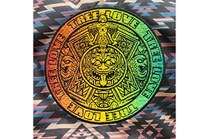
August 16, 2022 | Design + Digitizing
With this month’s On Design, we travel deep into the jungles of Central Mexico, harkening back to an ancient time where the Aztecs roamed the earth whilst building a formidable empire.
FULL STORY