Decorated-Apparel Transfer Printing with DTG
Today’s decorated-apparel professionals can dramatically expand their design and product offerings to include direct-to-film (DTF) with an existing direct-to-garment printer.
FULL STORY
You probably have seen a variety of shirts with designs that include incredible detail, vibrant colors and beautiful, bright prints. They make you do a double-take and wonder, “How did they do that?”
Unless you are a master screen printer with years of production and art-separation experience, one of the best ways to achieve such incredible results is with digital direct-to-garment (DTG) printing. But the key to success goes beyond the kind of printer or shirt brand used. Starting your job with the right type of art is critical for these “wow-factor” prints.
To that end, let’s look at the basic types of art needed for DTG printing, the correct formats to use and how to optimize files for best results.
Raster and Vector
Raster art is pixel based, meaning resolution is dependent on how many pixels fit within a square inch, or dots per inch (dpi). The higher the dpi, the clearer and higher in quality the image is. Raster art is made in Adobe Photoshop and Corel Photo or Paint.
With raster art, you cannot increase low-resolution art; you can only decrease its resolution. For example, you can’t take 72 dpi art and make it 300 dpi, but you can take 300 dpi art and make it 72 dpi.
A 72 dpi image at 10″ x 8″ will not provide sufficient quality for printing on a garment because it will be too pixelated. If you try and make the image larger, the resolution will degrade even further.
A 300 dpi image at 10″ x 8″ allows you to increase its dimensions while still maintaining decent quality. It’s important to remember that the larger you make a raster image’s dimensions, the more its quality will degrade.
There is an exception regarding resolution. If you have an image with extremely large dimensions, say 3,200 x 2,400 pixels (45″ x 34″), sufficient dpi exists at these large scales — even at 72 dpi — that you can reduce the image’s dimensions to fit within your print parameters and still maintain a high-quality print.
Using high-resolution art and large dimensions gives you the most versatile platform for maintaining a high-quality print. I prefer 300 dpi and about 14″ x 16″ for a standard front or back print.
Vector art is made in Adobe Illustrator or CorelDRAW. Vectors are created using mathematic equations within points, lines and shapes to create images that maintain clarity when scaled up or down without any loss of quality.
Vector art is extremely common and many designers prefer using vector programs. But most DTG software will not read vector art files. Therefore, you must export your vector art to a raster format.
File Formats
When saving art for DTG printing, always assume the image will need a transparent background. This is especially the case if you plan to print on dark garments with white ink.
Most DTG software will accept JPG, PNG, TIFF and other formats. JPG is only good on light garments that do not use white ink; otherwise, on a dark garment, the image’s background will be printed in white ink.
You must save or export your files as PNG or TIFF to preserve transparency. I recommend saving your print files as PNG, as it is a universal format that allows you to preserve transparency and maintain resolution.
To save your print-ready images in Photoshop or Paint, go to File>Save As>png. In Illustrator or CorelDRAW, you must export your image by going to File>Export>png.
If you are creating your own artwork in a raster program, always ensure you have a transparent background layer. This looks like a white and gray grid. If you see a white or colored background instead of the transparency grid, your printer will print the solid background on dark garments.
When exporting from a vector program, adjust the art size to the approximate print dimensions and export as a PNG file at 300 dpi.
Color and File Optimization
RGB is an additive color model in which red, green and blue hues are combined to form a color gamut. RGB input typically is used on electronic devices, TVs, computer screens, etc. RGB offers a larger color gamut than CMYK.
CMYK is a subtractive process requiring a white background using four colors; cyan, magenta, yellow, and black ink. It is the standard process for most common digital printing processes, and nearly all DTG printers use CMYK and white ink.
Even though this is the case, it’s a best practice to design art in RGB mode for all print applications for the following reasons:
1. CMYK file sizes are about 25% larger than those of RGB files.
2. Most filters and image enhancements are only available in RGB color mode.
3. Web art and most printers require RGB color mode so there is no need for conversion from CMYK.
Because you’re working in a vibrant spectrum like RGB, you’ll need to consider some functions you can use to optimize your artwork for maximum quality. The following list, courtesy of Great Dane Graphics, is useful for those who work in Photoshop; however, all of the functions also should available in Corel Paint.
I highly recommend following these instructions for all your complex art before you print.
1. In Photoshop, go to Image>Adjustments>Selective Color. Change the “Colors” pop-down menu to “Neutrals” and change all the values to between 3 and 8.
2. Go to Image>Adjustments>Hue/Saturation and move the Saturation slider to the right. It typically can be moved to anywhere within the 0-45 range. Move it to the right as much as needed to saturate your colors without becoming oversaturated and flat.
3. Go to Image>Adjustments>Brightness/Contrast, and move the Contrast to 5. If you have a newer version of Photoshop, you will see a “Use Legacy” check box; check it on.
4. Go to Image>Adjustments>Levels. Holding down your Option key, move the black slider on the left side of the Input levels to the right until you see black pixels on your screen. Then move the white slider on the right side to the left until you see white pixels on your screen. By doing this, you are setting your black and white points in your image and helping to reduce any “muddiness” in the colors.
5. Go to Image>Mode>Lab Color. Open your Channels palette and click on the Lightness channel to select it. Then, go to Filter>Sharpen>Unsharp Mask. Move the amount slider to the right. You can really crank up the sharpness because you are only working with the luminosity of the image, not the color (see Figures 1 and 2). As you can see in the images, the color values are way up, the image is less muddy, and noticeably crisper and clearer.
John LeDrew is the DTG director at Melco Intl., Denver. For more information or to comment on this article, email John at jledrew@melco.com.
Today’s decorated-apparel professionals can dramatically expand their design and product offerings to include direct-to-film (DTF) with an existing direct-to-garment printer.
FULL STORYThe past few years have brought changes to almost every industry, and decorated garment production is no exception.
FULL STORY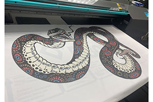
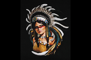
New Jersey-based Breakthrough Custom Clothing created “Warrior Princess” from scratch by digitally hand drawing the entire piece.
FULL STORY